
Overview
About Amazon
Shopping made easy! The Amazon mobile app is one of the most popular shopping apps for users all over the world. This is no doubt thanks to its speedy international deliveries (100+ countries in 3-5 days) and vast selection of millions of products!
Goal
The purpose of this heuristic evaluation is to identify existing usability issues within the Amazon mobile shopping application.
How
A user scenario was created and followed to conduct the most accurate of an evaluation as possible. The scenario follows the user through the journey in browsing the mobile app, selecting an item to add to cart, proceeding to checkout, and searching for answers in their help section related to their purchase.
The issues found in the Amazon app were assessed using the Nielsen's Heuristic List created by Jakob Nielsen. Each issue was given a severity from 0 to 4, where 4 is the most severe. For each heuristic issue identified, a recommendation was given to resolve the issue.

Evaluation
While the Amazon mobile app has many dedicated users that love its speed and ease of delivery, there are still many usability issues within the app that could still be improved to create an all-around better shopping experience. It is worth noting that interactions and on screen elements vary depending on operating system or mobile device, but the issues identified are the same across different platforms.
Aesthetic & Minimilist Design
Issue:
Home page is very cluttered with small text and lots of different images from advertisements, making it hard for users to digest the information being displayed.
Severity Ranking:

Recommendation:
- Break up content more visibly so users can adequately focus on what they're looking for.
- Use less and larger text (as necessary) to reduce cluttered appearance.
- Reorganize priority information that users would like to see to the top of the screen

Visibility of System Status
Issue
Clicking on the price filter should be showing price ranges to filter search results by, but it is showing "Subscribe & Save" feature instead.
Severity Ranking:

Recommendation
- Have the filter dropdown to show the correct filtering options so that the user can filter the product search results by desired price range.

Consistency and Standards
Issue
Users may be the confused because the same text is used as a heading and as a hint text. The bottom will keep the user on the same screen, the top will bring the user to another screen.
Severity Ranking:
Recommendation
- Remove the "Customer Questions" section from the product details page so ALL questions + answers are situated in the second screen instead.

User Control and Freedom
Issue
The top navigation bar changes when user enters the checkout/purchasing process, leaving the user stuck in this process and unable to go back to their shopping cart.
Severity Ranking:

Recommendation
- Have the same consistent navigation bar that is seen throughout the app (that contains the menu and shopping cart icon).
- Introduce a back button during the checkout process.

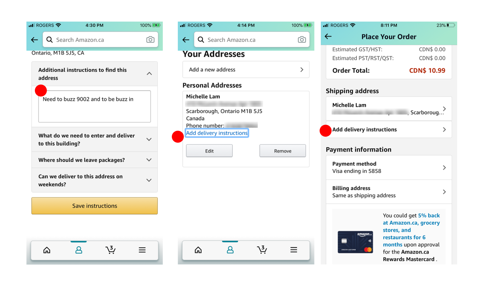
Recognition Rather Than Recall
Issue
After filling out delivery instructions and saved, user does not see the instructions appear under their shipping info. There is no indication that their input was registered, as the "add delivery instructions" button is still highlighted.
Severity Ranking:
Recommendation
- Have the delivery instructions shown below the user's address, so the user knows that the information they entered has been included with their order.
Help & Documentation
Issue
When doing a Customer Service search, the user received inaccurate results and couldn't get the information they needed. They had to refine their search question by one word; 'my'. Only then were they able to get results for what they are looking for.
Severity Ranking:
Recommendation
- Strengthen keyword search in order to provide user with more accurate results to their question/issue at hand.

Redesign
Most of the recommendations for the identified issues can be rectified by reordering elements and applying consistency across different screens.
Aesthetic & Minimilist Design
Dialogue should not contain information which is irrelevant or rarely needed.
Design Improvements
- Rearranged important information to the top of screen so users can spot immediately.
- Condensed the advertisements into one slider, to prevent excess clutter but still engage the user to its contents.
- Increased visibility and simplicity of “Unique Finds for Dad” through blue category labels to make them easily identifiable to users, and appear less like text just pasted onto the page.

Visibility of System Status
The system should keep users informed through appropriate feedback within reasonable time.
Design Improvement
- Corrected the filter options so that the user can properly narrow their product search results by desired price range. The filter options were taken from the Amazon website for consistency.

Consistency and Standards
Users shouldn't have to wonder whether different words, situations, or actions mean the same thing. Follow platform conventions.
Design Improvement
- Removed the "Customer Questions" section from the product details page and have all questions situated in the second screen instead.
- Bumped other content on the product page up.

User Control and Freedom
Users often make mistakes and need 'emergency exits' to leave the unwanted state. Support undo and redo.
Design Improvement
- Replaced the old navigation bar to the one that is seen throughout the app (that contains the search and shopping cart icon).
- Removed the “Menu” icon and introduced a back button in place.

Recognition Rather Than Recall
Minimize the user's memory load by making objects, actions, and options available. The user should not have to remember information. Instructions should be visible or easily retrievable whenever appropriate.
Design Improvement
- Included the delivery instructions with the shipping address and can be updated on the same page if user was to modify their address details.

Help & Documentation
Any necessary help documentation should be easy to search, focused on the user's task, list concrete steps to be carried out, and not be too large.
The original recommendation of refining keyword search is a backend solution, hence the solution cannot be displayed visually.
Design Improvements
- Rearranged the search bar to be higher up at the beginning of the screen so users knows they can search for an answer.
- Provided hypothetical keyword recommendations while user search so they can see and have access to a relevant article quicker.
