
Empowering users with the tools to improve patient accountability
MEDIQ is a mobile medication management app. Using the app, users can better educate themselves on their medication through easy to read digestible content and set up reminders to stay on track with medication administration.

Understanding the Problem
Approximately 43% of Canadians exhibit poor medication adherence by not taking their prescribed medication as directed or not taking them at all. This issue affects more than just the individual; it impacts those around them and medical resources. Seeing this happen in person and from personal experience, it was an issue I wanted to seriously take a deeper look into.
Yearly estimated impact

100,000

$100B
I created an online survey to better understand the perspective and potential reasons for this occurring. The results of the 62 participants were in line with the reported statistics. The reasons that were submitted for the lack of consistency or accountability include forgetfulness, believing they do not require it or situational circumstances. Surprisingly, the results from the survey contrasted from the user interviews I conducted with more long-term medication takers. The interviews indicated better management and adherence with the help of queues and an overall better understanding of their medical treatment.

+70%
+50%
+70%
Given the two distinct user profiles, I thought about the question of how might we help patients start or continue to learn about their medication and maintain their intake schedule to improve their medical adherence?
Analysis
Persona
I created the personas Gerald and Heidi to represent the two audiences identified from the survey results and interview insights: the experienced patient with an established schedule, and the new patient who has not taken medication for an extended period of time before. Despite the vast differences in behaviour between the new and the experienced on how they manage their medication, they have a common goal to take their medication properly to maintain their health.


Experience Map
I chose to focus on specifically the experience of new users like Heidi because there were areas of opportunity that can be realized during the "Understanding" and "Administering" phase to help new users transition easily and become self sufficient without depending on aids. This is also applicable to the more experienced user Gerald; where opportunities can be found to be a reminder or book of record.

User Stories
Based on Heidi and her experience, I wrote these user stories to reflect the overall journey starting with the patient building a routine and then progressing towards tracking their progress consistently. I divided the stories into the following categories: logging, management, and notification.


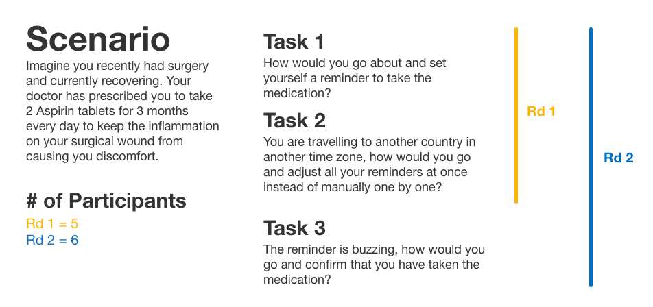
Task Flows
I decided to focus on the "Management" user stories because its the critical first step the users need to take before they can start tracking their progress. The primary task flow centers around the user setting up a medication schedule with the proper information and reminder notifications.

A secondary task was later included that dealt with the second part of the journey when the user begins logging their progress.

Prototype
Concept Sketches
Based on the primary task flow, I created a set of concept sketches to display the layout of content and actions the user will need to take to create a medication schedule/reminder. Certain design choices such as the use of material design cards and FAB buttons were driven from my inspiration board.


User Testing
Throughout the creative process, from concept sketches to medium fidelity prototypes, I conducted user testing to get feedback on the designs. Their feedback was pivotal in identifying concepts and elements that required improvement or removal. An additional task was included to the second round testing to assess the later added secondary task flow.
Version Iterations
Concept Sketches → Version 1
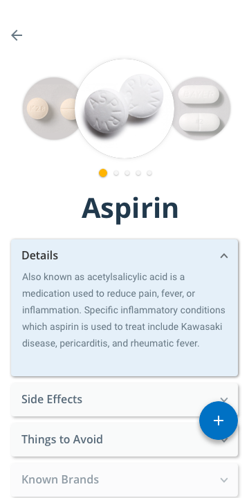
I made several design changes during my process of converting the sketches to version 1 of my mid-fidelity wireframes. The main reason for the changes was to make the designs more consistent and to adhere to material design guidelines. I decided to include expansion cards to reduce clutter and provide users the ability to hide information they didn't want to see.

- Introduction of expansion cards to reduce clutter and improve readability by allowing users to hide and show what they want

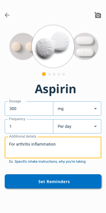
- Auto field populations of date and time to provide visual guidance on what the users need to populate
- Floating CTA buttons for quick accessibility and improve task completion efficiency without the users being confused or the need for unnecessary scrolling to move to the next screen
Version 1 → Version 2
Users from the first round of user testing were confused about the intention of certain icons and field labels; they were interpreted differently than my assumptions. Another issue was the medication information they were looking for was either inadequate, not what they were looking for, or not in the order of importance they believed should be.
Based on this feedback, I prioritized a list of notable user improvements for version 2.

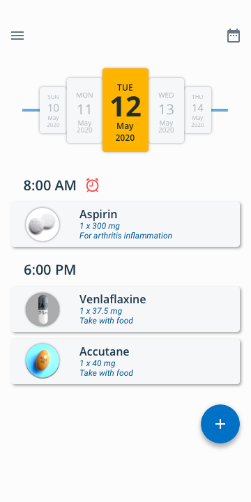
- Appended additional info such as dosage and instructions to each medication instance that users want to see
- Relabelled the FAB icon from a "pill" to a "plus" to mitigate confusion of what the button does

- Added a calendar icon to allow user to go to a specific date and see the schedule (past or future) without the need to scroll through the carousel
- Included a screen for the navigation drawer so users are able to find additional features

- Revised the list of categories in the medication details and the information hierarchy based on the feedback on what is most important to the users

- Repurposed the “Dosage” field and introduced a new input field for the “Frequency”. This is to align what the user understands "dosage" is; measurement of the medication, not the quantity they need to take
- Increased input field padding and length
- Updated camera icon to better reflect what the intended action the user should expect; to add a personal picture of the medication
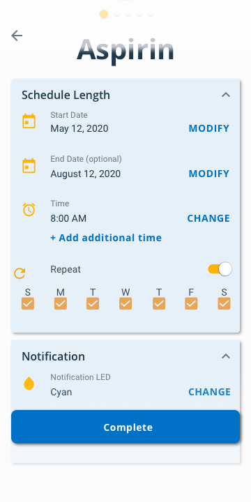
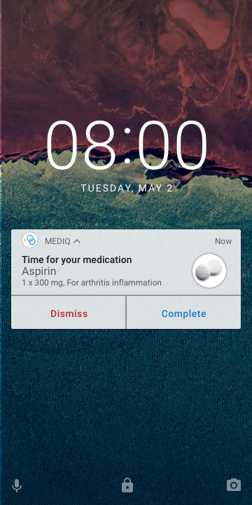
In between the testing rounds, I added an additional user flow where the user will be notified when it is time to take their medication. The user can verify their completion either through the notification on the lock screen or by swiping the schedule instance to the right on the app.

Version 2 → Version 3
The issues found from the first round of usability testing were not mentioned at all during the second round, hence I can presume they have been resolved. The swiping mechanic introduced for the secondary user flow was not intuitive as a majority of the testers had difficulty completing the task. Because of this, the following major change was made for version 3.

- Included an additional method for user to verify their completion
- Going into the schedule instance
- Included an additional checkmark on home screen to indicate to users that the particular instance is marked complete. This is to resolve accessibility issues with using only colour as a state indication.
visual DESIGN
Colour Palette
I approached all the UI design decisions based on the principle that it had to be clean and minimalistic. From the design, I wanted to convey to the user how easy and stress-free it can be on building the habit to take their medication correctly. Blue was selected as the primary palette to reflect these values because it is commonly used in the healthcare industry and is associated with knowledge, tranquility, security, and trust.

Typeface
To complement the colour palette, the clean sans serif typefaces help structure the organized information without feeling too restricted. It also matches the consistency of the concise information presented without compromising legibility.


Logomark
MEDIQ was chosen as the brand name because it is a combination of the words medical and IQ. I wanted the brand to be the source of knowledge that helps the user improve their medical IQ and adherence. The pill was selected as part of the wordmark and logo to represent medication. The pill was designed in a single line to symbolize that there are no short cuts to improving your health.
Exploration
Marketing Website
I further imagined what I wanted my product's brand to convey and established the continuity with the product by being concise with the narrative and simplistic on the website design. I created a responsive marketing website for both desktop and mobile. Just like the mobile application, I used blue as the primary colour to instill trust.
Exploration beyond the mobile environment
If there is an opportunity to bring MEDIQ onto another platform, I would consider it to be on wearables. The rising prominence of smartwatches makes it an ideal platform for individuals who have a busy lifestyle or on the go. It is easier to access and is a much more efficient method to stay on track and log progress without the need to take out your phone. With just a tap on the wrist, and you are good to go!
Looking into the future
The next step to improving patient accountability is to involve healthcare professionals and allow them to be a part of the journey. Expanding the capabilities of MEDIQ to the healthcare network would give doctors qualitative data and insight into a patient’s progress, which may be beneficial in adjusting/tailoring one’s treatment.
Key learnings
It has been a challenging yet exciting project with a lot to take away from, considering it was my first solo project. Going through the design process has helped me develop my UX design mindset and technical skills that I will use throughout my career. The three key points below are fundamental principles that I have realized during this project, and is something I will continue remind myself for all future projects I will be a part of.
Designing with
intent
The heart of UX is to design with the intent of solving a user's need or problem. Aesthetics come afterwards and should not compromise the experience.

Design is a
collaborative effort
How one user uses the product may differ from one another. Collaboration and feedback is important to avoid biases.

Design is an
iterative process
New technologies continue to emerge, and user behaviours will change. Designs must follow the trend, so it is vital to keep the product up to date.